The future used to be shiny.
It was translucent blue plastic, silver typography, impossible architecture, liquid-metal gradients and interfaces that looked as if they had been transmitted from a better version of the next century.
By the end of the 1990s, technology was not merely being sold as useful. It was being sold as evidence that tomorrow had already started.
Twenty-seven years later, a lot of those visions look naive. They also look fantastic.
THE FUTURE HAD A VISUAL LANGUAGE
Late-90s futurism was not one coherent design movement. It was a collision of Y2K graphics, rave flyers, industrial design, glossy magazine ads, game interfaces, music videos, translucent electronics and the optimism surrounding consumer technology.
The important thing is that the future was visible.
You could identify it by texture. Chrome meant speed. Transparency meant advanced technology. Blue light meant information. Rounded plastic meant friendliness. Metallic type meant you were looking at something that had arrived from five years ahead.
None of those rules were rational. They did not need to be. They created a shared picture of what progress was supposed to feel like.
WE WERE NOT NOSTALGIC FOR THE PAST YET. WE WERE NOSTALGIC FOR THE FUTURE.
The period now feels powerful because it preserved a version of tomorrow that never quite arrived.
TECHNOLOGY WAS ALLOWED TO LOOK LIKE TECHNOLOGY
One of the strangest things about contemporary devices is how little they often advertise their own machinery. Phones are rectangles. Laptops are increasingly slabs. Interfaces hide complexity behind smooth surfaces, neutral typography and gestures designed to feel inevitable.
That is good industrial design in many ways. It is also very quiet.
Older consumer technology was often louder about what it was. You could see vents, hinges, ports, screws, memory slots and translucent shells. Hardware invited inspection. Software announced itself with startup animations and elaborate menus.
The object wanted you to know it was a machine.
1999 BELIEVED IN ARRIVAL
There is a specific confidence in design from that period that is hard to reproduce now. The internet was expanding, game hardware was accelerating, mobile devices were mutating rapidly and digital culture still felt open enough that nobody knew exactly what would win.
That uncertainty created visual ambition.
Designers could imagine the future as chrome, glass, bio-organic forms, cyberpunk darkness or clean white utopia because there was no single dominant interface telling everyone what the future had to look like.
The future was inconsistent. That made it feel larger.
WHY WE KEEP BRINGING IT BACK
Today, the old future appears everywhere again: in fashion campaigns, sneaker design, game UI, music visuals, posters and websites that deliberately reject frictionless minimalism.
That revival is easy to dismiss as nostalgia, but nostalgia is only half the story. The deeper attraction is specificity. Those aesthetics communicated a point of view immediately.
They were not embarrassed to look designed.
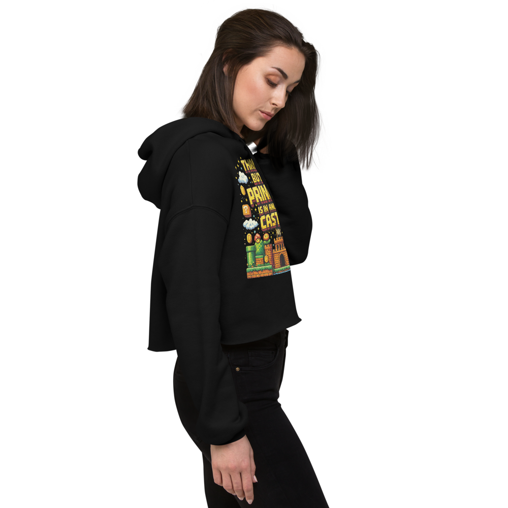
That is also why a tiny line from an old game can still carry enough weight to become a piece of clothing. The objects and interfaces from that era accumulated meaning because they were distinct enough to remember.
THE PAST IS FULL OF ABANDONED FUTURES
We do not need to pretend 1999 was better. It was not. The technology was slower, the web was harder to use and a huge amount of design from the period was genuinely terrible.
But cultural memory is not a technical benchmark. We return to the era because its mistakes were interesting and its ambitions were visible.
The future looked better in 1999 because it still looked like a place.
GOOD CULTURE DOESN’T EXPIRE.
Drop 001 is built around the same idea: take a small piece of an older digital world and give it a new physical life without sanding away the reference.
Kulture note: this is an editorial essay on late-1990s technology aesthetics, interface culture and the way future-facing design becomes nostalgia.